
Colour Drenching: The Bold Decorating Technique That Defies the Neutral Ceiling
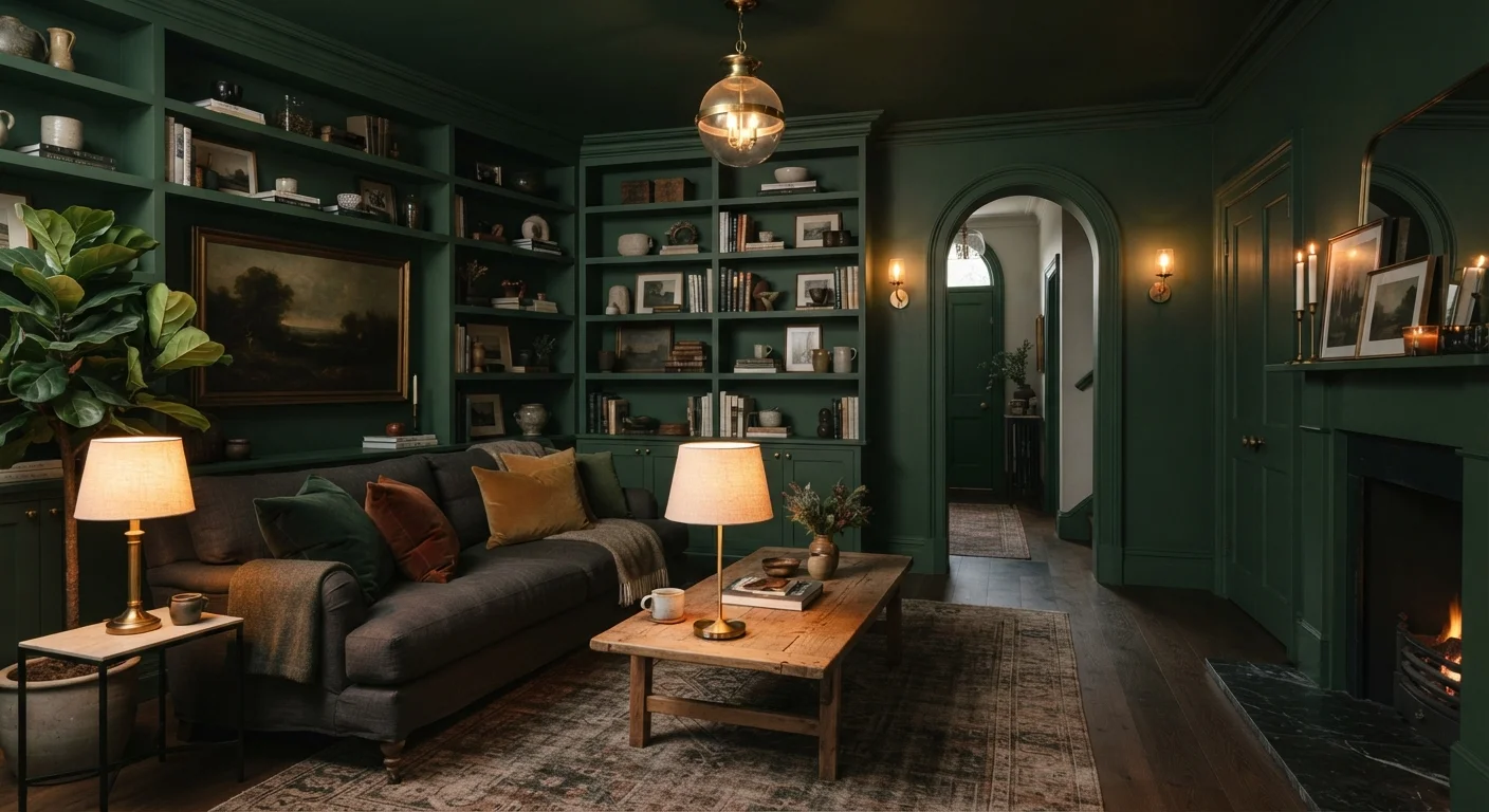
Photo credit: ResultsPivot.com | Discover Insightful Content!
In this article
Painting walls, trim, and ceiling in one continuous colour is having a moment. Find out how colour drenching works and when it actually succeeds.
Key Takeaways
- Colour drenching covers walls, trim, ceiling, and doors in a single continuous colour.
- The technique works in any room size — small rooms can actually feel more intentional, not cramped.
- Finish variation (matte on walls, eggshell on trim) adds subtle texture without breaking the colour envelope.
- Deep, saturated hues and warm mid-tones tend to perform better than very pale shades.
- Furniture and textiles in contrasting tones become focal points against a drenched backdrop.
Where the Trend Comes From
The neutral ceiling — that default stretch of flat white above everything — has been the unchallenged norm in American interiors for generations. It felt safe, practical, and resale-friendly. But design culture has been quietly pushing back, and colour drenching is one of the most visible results of that shift.
The technique has roots in traditional British interiors, where enveloping a room in a single dark tone was common in libraries, studies, and parlours long before it became a social media moment. What's changed is accessibility: paint brands now offer thousands of deep, complex colours at consumer price points, and interior design content online has made it easy for homeowners to see finished examples before committing.
“Colour is one of the most powerful tools in interior design, and drenching it across every surface removes the hesitation we usually build in. It signals confidence — that this was a decision, not a default.”
— Design commentary widely observed in current interior design discourse, Reflected across editorial coverage of contemporary home design trends
Why It Works (and Why It Doesn't Always)
The visual logic behind colour drenching is straightforward. When every surface shares the same colour, the eye stops tracking the edges of the room. Corners recede. The ceiling feels less like a lid and more like a continuation of the space. The result is an immersive quality that's hard to achieve any other way.
It works best when:
- The colour has enough depth or warmth to carry across all surfaces without feeling washed out.
- Furniture and soft furnishings provide contrast — a linen sofa against a forest-green room pops harder than it ever would on a white wall.
- Natural or layered artificial light is considered during colour selection, since a hue that reads rich in afternoon sun may turn flat under recessed LEDs.
Where it underperforms: very pale or cool grays tend to flatten out completely when drenched. The effect that makes the colour interesting on one wall disappears when the contrast is gone.
Test Your Colour Under Real Lighting
Before committing, paint a large swatch — at least 12 by 12 inches — on both a wall and the ceiling and observe it at different times of day and under your artificial lighting. Colours shift significantly between daylight, warm incandescent, and cool LED sources. This step prevents the most common drenching regret: choosing a hue that looked right in the store but reads differently once it covers the entire room.
How to Actually Execute It
The physical process isn't dramatically different from a standard paint job, but a few details matter.
Start With the Ceiling
Work top to bottom. Paint the ceiling first in the same colour you'll use on the walls (or a slightly lighter tint if you're doing tonal drenching). Cutting in neatly at the ceiling-wall junction matters less here than in conventional painting — any slight overlap is invisible when everything is the same colour.
Don't Skip the Trim
This is where the technique lives or dies. If the baseboards, window casings, and door frames stay white, the drenching effect breaks apart. Paint every inch of trim, ideally in a slightly higher sheen than the walls for subtle variation.
Extend to Doors and Built-Ins
Painting interior door faces and any built-in shelving or cabinetry in the same tone completes the envelope. Even radiator covers and switch plate surrounds benefit from the same treatment.
~65%
US homeowners who used neutral wall colours in recent years
Industry surveys from paint manufacturers have consistently shown that beige, greige, and white tones dominate American residential colour choices, making drenching a notable departure from the norm.
2–3 gallons
Typical paint needed for a drenched small room
Covering walls, ceiling, and trim in a standard 10-by-12-foot room generally requires more product than a standard two-coat wall-only job, so budget accordingly.
Rooms That Suit This Approach
Almost any room can be drenched, but some spaces tend to deliver the biggest payoff.
Whatever room you choose, the key is committing fully. Partial drenching — walls and ceiling but white trim, for instance — often reads as an incomplete paint job rather than a deliberate choice.
Tonal Drenching as a Gentler Entry Point
If committing to one exact paint code across every surface feels like too large a leap, tonal drenching offers a middle path. Choose one hue and use a slightly lighter version on the ceiling and a slightly deeper version on the trim. The result maintains the envelope effect while adding a bit more dimension. It's a useful approach for anyone who wants the look without the full commitment.
Frequently Asked Questions

Author
Home & Living Editorial Team
Home & Living Editorial Team is the collective byline for our editorial team and contributor network. Articles published under this byline or an editorial pen name are researched, written, and reviewed according to our editorial standards for clarity, consistency, and independence before publication.
View all articles →