
The Quiet Luxury Interior: Key Characteristics of the Understated Elegance Trend
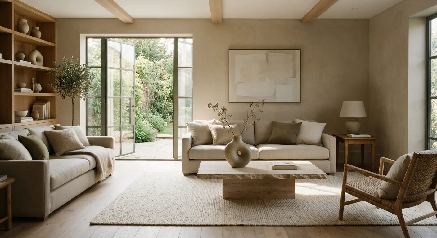
Photo credit: ResultsPivot.com | Discover Insightful Content!
In this article
Quiet luxury in fashion translated fast to home design. Here's what defines the aesthetic — and what it deliberately leaves out.
What Is Quiet Luxury in Interior Design?
Quiet luxury started as a fashion conversation — think unbranded cashmere, tailored neutrals, and zero visible logos — but it translated to interior design almost immediately. The home version follows the same logic: spaces that signal taste and quality through restraint rather than display.
This isn't minimalism for minimalism's sake. It's a deliberate curation of materials, finishes, and objects that rewards closer inspection. A room that reads as calm at a glance reveals well-chosen details — natural stone, handcrafted ceramics, linen with genuine weight — when you actually sit in it.
| Design category | Interior aesthetic / decor trend |
| Origin context | Emerged from quiet luxury fashion movement |
| Dominant palette | Warm neutrals: oat, sand, greige, soft sage, warm white |
| Key materials | Natural stone, solid wood, linen, wool, unglazed ceramic |
| Defining principle | Quality and restraint over quantity and display |
| Closest related aesthetics | Warm minimalism, Japandi, Old Money |
It contrasts sharply with maximalism or status-driven decor, where presence is announced loudly. Quiet luxury assumes you don't need to explain your choices. Compare it to the visual warmth of Cottagecore at home, which layers pattern and nostalgia rather than stripping back to essentials.
The Core Characteristics
A Neutral, Nature-Derived Palette
The color story in quiet luxury interiors rarely strays far from what you'd find in a quarry or forest floor: warm whites, sand, oat, greige, soft sage, and deep charcoal used sparingly. Walls, large furniture pieces, and textiles tend to stay within a close tonal range so the room reads as unified rather than assembled.
Material Quality Over Quantity
This is the load-bearing principle of the entire aesthetic. Fewer objects, but each one earns its place through genuine material quality — stone instead of stone-look laminate, solid wood over veneered particleboard, natural-fiber textiles over synthetic alternatives. The hierarchy is tactile, not visual.
Quiet luxury
An aesthetic defined by understated quality, neutral palettes, and the deliberate absence of logos, bold patterns, or status signaling. It values craftsmanship and restraint over display.
Tonal layering
A decorating technique in which colors within a narrow range are combined to create depth and cohesion. In quiet luxury interiors, this typically means stacking shades of cream, sand, and warm gray.
Boucle
A looped, textured fabric commonly used in upholstery. Recognized by its nubby, cloud-like surface, boucle is a signature texture in quiet luxury and warm minimalist interiors.
Greige
A blend of gray and beige that sits in a warm neutral zone. Greige walls and furniture are common anchors in quiet luxury color palettes.
Intentional editing
The practice of selecting and displaying only objects that have been consciously chosen, removing accumulated or incidental items. In quiet luxury, editing is an active, ongoing discipline rather than a one-time declutter.
Natural-fiber textiles
Fabrics made from plant or animal fibers — linen, wool, cotton, jute — rather than synthetic alternatives. These materials are preferred in quiet luxury interiors for their texture, durability, and tactile quality.
Texture as the Primary Visual Interest
Without bold color or pattern to draw the eye, texture does the work. Boucle upholstery, rough-hewn plaster walls, ribbed linen, matte ceramic, brushed metal — these create visual depth without noise. Layering textures within a narrow palette is one of the defining techniques of the look.
Intentional Editing
Surfaces stay clear. Shelves hold three objects instead of thirty. Every item that remains visible has been chosen, not accumulated. This is where quiet luxury diverges most obviously from maximalism — and it's also what makes it genuinely demanding to execute well.
Craftsmanship Signals Over Brand Signals
A hand-thrown ceramic bowl, a hand-stitched cushion, joinery details on a cabinet — these are the things that signal quality in a quiet luxury interior. Logos and labels are absent by design.
What Quiet Luxury Deliberately Leaves Out
Understanding the aesthetic is partly a process of subtraction. Absent from a quiet luxury interior: bold graphic prints, high-gloss lacquer finishes, visible brand markings, trend-driven accent colors, and anything that reads as a short-term fad.
Top 5
Interior search trend on Pinterest
Pinterest's annual trend reporting has consistently listed neutral, refined aesthetics among its most-searched home categories in recent years.
3–5
Recommended objects per open shelf
Interior stylists commonly cite this range as the threshold between intentional curation and visual clutter in quiet luxury-aligned spaces.
Also notably absent: the fussiness sometimes found in maximalist or heavily curated spaces, and the stark coldness that can creep into certain minimalist directions. If you're curious about the distinction, warm minimalism vs. cold minimalism explores how minimalism itself splits into distinct emotional registers — and quiet luxury often sits closer to the warm end of that spectrum.
Clutter is the most obvious exclusion, but the more nuanced edit is removing anything that feels like performance — objects displayed to signal effort rather than chosen for genuine purpose or beauty.
Applying the Principles Without a Renovation Budget
The principles of quiet luxury translate across a wide range of budgets — the point is selectivity, not spending. Editing what's already in a room costs nothing. Swapping a synthetic throw for a natural-fiber one, repainting in a warm neutral, or clearing a surface and leaving it clear are all moves that shift a space toward this aesthetic without major investment.
Quality Materials Are Tactile, Not Just Visual
One reason natural materials matter so much to this aesthetic is that quality is most apparent when you touch something — the weight of linen, the coolness of stone, the density of solid wood. In a design language that avoids loud visual cues, texture and material become the primary communication. This is why swapping out a synthetic rug for a wool or jute alternative can meaningfully shift how a room feels, even if the visual change is subtle.
Where spending is worthwhile: prioritize pieces that are touched often — a sofa, a bedding set, a rug — since the quality of natural materials is most noticeable in texture and feel. A less-expensive lamp matters far less than an upholstered chair you sit in every day.
The approach also favors patience. Building a quiet luxury interior typically means buying fewer things more deliberately over time rather than furnishing a room all at once.
Warm Minimalism vs. Cold Minimalism
Explores how two strands of minimalism diverge in color, texture, and emotional tone — useful context for anyone trying to land a quiet luxury interior that feels livable rather than austere.
Cottagecore at Home
A practical look at the Cottagecore aesthetic that makes for an instructive contrast: where quiet luxury edits and restrains, Cottagecore layers, patterns, and embraces the imperfect.

Author
Home & Living Editorial Team
Home & Living Editorial Team is the collective byline for our editorial team and contributor network. Articles published under this byline or an editorial pen name are researched, written, and reviewed according to our editorial standards for clarity, consistency, and independence before publication.
View all articles →